
This is a follow on from the previous update, but this time I will detail some more features, add some pretty pictures and discuss where the project is going from here.
Dead social has been live for something like a week now, without issues (mostly). Backups are taken several times a day, so pushing development code onto the server is relatively low risk. I’m also the only user, so I’m playing a risky game with my own data.
The following are a handful of screenshots showing some of the system states - but in all honesty most of the work has been in the background details.
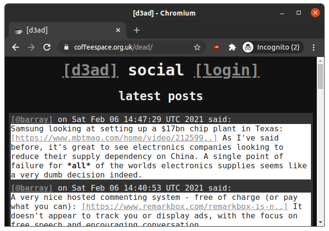
The home screen for a logged out user should be pretty similar to that of a logged in user. It displays the most recent 16 posts (site wide), with no algorithm bias. The idea will be to just have random exposure from absolutely anybody.
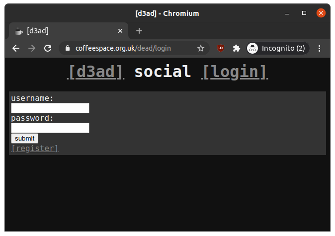
This allows the user to login if they have an account, otherwise they have the option to register provided to them. If the login fails, they are redirected to the same login page, otherwise the home page.
If the user is logged in, this will just display the home page.
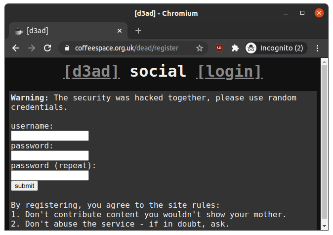
This allows the user to register a new account. If the registration fails, this come back to the same page, otherwise they are automatically logged in and taken to the home page.
If the user is logged in, this will just display the home page.
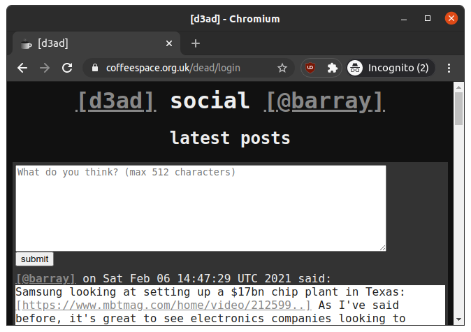
As said previously, the logged in home page shouldn’t be different in reality - except now we see the ability to post a new entry.
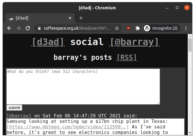
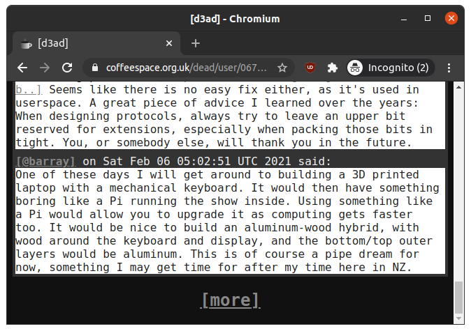
The user page should just offer the list of posts from this particular user. Of course from the logged in perspective, you can also leave a comment.
At the bottom of each user page, there is an option to load more entries.
For those playing along at home, you can see the CSS is real simple - but probably even more simple than you can imagine. It comes in at just 280 bytes (minified for the site of course):
0001 html{
0002   background-color: #111;
0003   color: #EEE;
0004   font-family: monospace;
0005   font-size: 16px;
0006 }
0007
0008 h1, h2{
0009   text-align: center;
0010 }
0011
0012 quote{
0013   background-color: #FFF;
0014   color: #222;
0015   display: block;
0016 }
0017
0018 a{
0019   color: #888;
0020 }
0021
0022 a:before{
0023   content: "[";
0024 }
0025
0026 a:after{
0027   content: "]";
0028 }
0029
0030 form, p{
0031   background-color: #333;
0032   margin: auto;
0033   max-width: 640px;
0034   padding: 4px;
0035 }
Any improvements that reduce the size, but keep the same look and feel (if not make it better) are greatly appreciated.
So a few things have improved since the last post:
StringBuilder called Str.String and BigInteger for processing 512 bit
numbers.I’ll drop another update when more progress is made!